St. Louis Web Design Services

Insite Advice Web Design
Ready to Take Your Business to the Next Level?
We are a St. Louis SEO company that prides itself on delivering measurable results to our clients.
Contact us today to get started!
Professional Web
Design Services
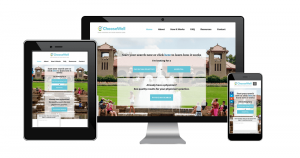
Innovative, functional, and responsive website design services unique to each customer, built to engage, inform and convert leads.
WordPress Website
Design Service
We believe WordPress is the standard and is the best converting site for search marketing. We specialize in WordPress web design for your website build and website redesign needs.
Custom Web
Development
We have experience with all sorts of Web Development tools including WordPress, HTML, CSS, JavaScript, and many more!
How We Approach Design
Every client is unique in what they need and what they want, so we first take the time to hold an initial discovery meeting to get to know you, your business, and your goals. After a contract is signed, we move forward with the process. Web design tips are plentiful on the internet. Many people have their own ideas of what the ideal website might look like. We’re committed to working with St Louis businesses on customized website development that they can be proud of.
Web design is a critical component of a small business’s growth. Almost 50% of people cite the functionality of a website as the primary element in determining a company’s reputation. As a result, it has an impact on conversions, bounce rate, and more.

Our Tips and Tricks For Perfect Web Design
1. Prioritize site speed over all others
3. Capitalize on Hick’s Law
According to Hick’s Law, the more options a person has, the longer it will take for them to make a decision. There is interesting research on this phenomenon in which people were offered more or fewer kinds of jam to sample in a supermarket. People with more options were significantly less likely to purchase jam than those with fewer options. How important is this for your website? Are you willing to increase conversions simply by restricting the options available to consumers? The following are a few descriptions of how it could look:
- Reduce the number of menu items.
- Restriction of type fields.
- Concentrate on a single call to action.
- Display social buttons only for networks where you are an active user.
- Maintain a single target per website.
5. Limit the usage of carousels, sliders, tabs, and accordions
Carousels are a favorite of website users. It’s perhaps the most often-asked function. Regrettably, evidence indicates that they are mostly ineffective and should be omitted from your custom web design.
Notre Dame University has some of the most mind-blowing numbers. The webmaster found that the first slide in a carousel got nearly 90% of clicks, while the other slides were virtually overlooked.
Tabs and accordions have the same issue as sliders and carousels in that they are often overlooked. This is exacerbated even by the fact that few users read the whole website. The majority of people search and are therefore unlikely to make additional clicks.
7. Use Visual Cues to Guide Attention
One of a web design company’s primary duties is to direct people’s attention. This can be accomplished by assigning varying weights to various components, thus focusing attention in the desired direction.
However, a web designer can do this with more simple visual cues. One is by capitalizing on the idea that humans have a natural tendency to glance in the same direction as people they see in advertisements. This is a fact and a good web designer will use it to focus marketing emphasis on specific areas on your website.
9. Use the Appropriate List Order
Utilizing collections, both arranged and unordered is an excellent way to increase the accessibility of content. However, it points out that human attention is indeed fickle in this case.
This is due to the phenomenon known as the serial position effect. It essentially states that you are more apt to recall all the things at the beginning and the end of a list. On the other side, the middle segment is largely ignored.
The lesson here is to choose the most critical qualities of your product or service while listing them.
2. Capitalize on the Fold
The existence of the fold is a point of contention. According to some, the fold no longer matters due to the variety of screen sizes available today. Others disagree. However, in 2018, people spent 57% of their time outside the fold, followed by a rapid fall. They spend 74% of their time on the first two screenfuls.
This is an important function of graphic design. Thus, it seems as if the fold is still important. For your new website, this involves prioritizing content marketing material and using the limited room to entice visitors to stay. Here are a few pointers about how to do that: Utilize an evocative yet succinct headline. Describe what the platform will do for tourists and emphasize the advantages. Be succinct and use strong language.
To maximize conversions, the fold is the optimal place to begin the consumer journey. Ascertain that the CTA is both transparent and noticeable. Including visual and audio elements – Images, videos, and audio both help to highlight the argument.
4. Maintain simplicity
Continuing the concept of minimalism often extends to your overall style. Google conducted a large survey and discovered that travelers dislike visual ambiguity. The gist is that the more complicated your architecture is, the less attractive it is considered to be by users. What does this imply for your website’s performance? Apart from the argument made previously, below are a few suggestions:
Consider the sidebar – The sidebar is being phased out of an increasing number of websites in favor of a single-column style (for example, the one you are on right now). This implies fewer obstacles and a strong emphasis on branding and material. Maintain consistent formats – People crave comfort and may be taken aback by unusual website designs. As a result, it might be prudent to adhere to the well-known style tropes and layouts of responsive web design. Make an impression.
6. Give Scrolling Priority Over Clicking
So, if you’re not going to compact data onto sliders and/or accordions, how are you going to show it? The solution is to condense all into a single long list, even items that are typically hidden away. This method works. Crazy Egg has an interesting case study that demonstrates this argument. They went from an easy, brief sales page to one that was 20 times longer. As a consequence, conversions increased by 30%!
Users seem to like scrolling far more than they do tapping. Therefore, if you are already dispersing product details through several sites, it is time to rethink your content creation.
8. Have People in Your Photographs (But Avoid Stock Photos)
Apart from using them to draw publicity, having other users in the website’s photos is a good practice in general. Humans crave social interaction, both in-person and online.
This is shown in one of Basecamp’s case studies. They increased conversions by 102.5 percent when they switched from a text-based landing page to one that featured a big picture of a human in the background.
Utilize human beings in website graphics Uncomplicated but successful. However, there is one caveat: stock images will quickly undo the entire impact. According to a Nielsen Norman Group report, we are extremely adept at identifying and tuning out these generic videos.
As a result, if you want to include photographs of individuals on the blog, ensure they are genuine and authentic. This also benefits search engine optimization and other internet marketing strategy.
10. Capitalize on Social Media
Our final website design tip concerns the so-called conformity bias. This is the human proclivity to copy others, including through graphic design. That is, if a community of people approves of anything, it increases the likelihood that others may feel the same.
One way to demonstrate this on the website is by the use of social media marketing. If you can demonstrate that others value your blog, material, commodity, or service, new users are more likely to feel the same way.
This is most readily shown by the number of Facebook followers, retweet counts, media references, and testimonials.
1. Prioritize site speed over all others
2. Capitalize on the Fold
The existence of the fold is a point of contention. According to some, the fold no longer matters due to the variety of screen sizes available today. Others disagree. However, in 2018, people spent 57% of their time outside the fold, followed by a rapid fall. They spend 74% of their time on the first two screenfuls.
This is an important function of graphic design. Thus, it seems as if the fold is still important. For your new website, this involves prioritizing content marketing material and using the limited room to entice visitors to stay. Here are a few pointers about how to do that: Utilize an evocative yet succinct headline. Describe what the platform will do for tourists and emphasize the advantages. Be succinct and use strong language.
To maximize conversions, the fold is the optimal place to begin the consumer journey. Ascertain that the CTA is both transparent and noticeable. Including visual and audio elements – Images, videos, and audio both help to highlight the argument.
3. Capitalize on Hick’s Law
According to Hick’s Law, the more options a person has, the longer it will take for them to make a decision. There is interesting research on this phenomenon in which people were offered more or fewer kinds of jam to sample in a supermarket. People with more options were significantly less likely to purchase jam than those with fewer options. How important is this for your website? Are you willing to increase conversions simply by restricting the options available to consumers? The following are a few descriptions of how it could look:
- Reduce the number of menu items.
- Restriction of type fields.
- Concentrate on a single call to action.
- Display social buttons only for networks where you are an active user.
- Maintain a single target per website.
4. Maintain simplicity
Continuing the concept of minimalism often extends to your overall style. Google conducted a large survey and discovered that travelers dislike visual ambiguity. The gist is that the more complicated your architecture is, the less attractive it is considered to be by users. What does this imply for your website’s performance? Apart from the argument made previously, below are a few suggestions:
Consider the sidebar – The sidebar is being phased out of an increasing number of websites in favor of a single-column style (for example, the one you are on right now). This implies fewer obstacles and a strong emphasis on branding and material. Maintain consistent formats – People crave comfort and may be taken aback by unusual website designs. As a result, it might be prudent to adhere to the well-known style tropes and layouts of responsive web design. Make an impression.
5. Limit the usage of carousels, sliders, tabs, and accordions
Carousels are a favorite of website users. It’s perhaps the most often-asked function. Regrettably, evidence indicates that they are mostly ineffective and should be omitted from your custom web design.
Notre Dame University has some of the most mind-blowing numbers. The webmaster found that the first slide in a carousel got nearly 90% of clicks, while the other slides were virtually overlooked.
Tabs and accordions have the same issue as sliders and carousels in that they are often overlooked. This is exacerbated even by the fact that few users read the whole website. The majority of people search and are therefore unlikely to make additional clicks.
6. Give Scrolling Priority Over Clicking
So, if you’re not going to compact data onto sliders and/or accordions, how are you going to show it? The solution is to condense all into a single long list, even items that are typically hidden away. This method works. Crazy Egg has an interesting case study that demonstrates this argument. They went from an easy, brief sales page to one that was 20 times longer. As a consequence, conversions increased by 30%!
Users seem to like scrolling far more than they do tapping. Therefore, if you are already dispersing product details through several sites, it is time to rethink your content creation.
7. Use Visual Cues to Guide Attention
One of a web design company’s primary duties is to direct people’s attention. This can be accomplished by assigning varying weights to various components, thus focusing attention in the desired direction.
However, a web designer can do this with more simple visual cues. One is by capitalizing on the idea that humans have a natural tendency to glance in the same direction as people they see in advertisements. This is a fact and a good web designer will use it to focus marketing emphasis on specific areas on your website.
8. Have People in Your Photographs (But Avoid Stock Photos)
Apart from using them to draw publicity, having other users in the website’s photos is a good practice in general. Humans crave social interaction, both in-person and online.
This is shown in one of Basecamp’s case studies. They increased conversions by 102.5 percent when they switched from a text-based landing page to one that featured a big picture of a human in the background.
Utilize human beings in website graphics Uncomplicated but successful. However, there is one caveat: stock images will quickly undo the entire impact. According to a Nielsen Norman Group report, we are extremely adept at identifying and tuning out these generic videos.
As a result, if you want to include photographs of individuals on the blog, ensure they are genuine and authentic. This also benefits search engine optimization and other internet marketing strategy.
9. Use the Appropriate List Order
Utilizing collections, both arranged and unordered is an excellent way to increase the accessibility of content. However, it points out that human attention is indeed fickle in this case.
This is due to the phenomenon known as the serial position effect. It essentially states that you are more apt to recall all the things at the beginning and the end of a list. On the other side, the middle segment is largely ignored.
The lesson here is to choose the most critical qualities of your product or service while listing them.
10. Capitalize on Social Media
Our final website design tip concerns the so-called conformity bias. This is the human proclivity to copy others, including through graphic design. That is, if a community of people approves of anything, it increases the likelihood that others may feel the same.
One way to demonstrate this on the website is by the use of social media marketing. If you can demonstrate that others value your blog, material, commodity, or service, new users are more likely to feel the same way.
This is most readily shown by the number of Facebook followers, retweet counts, media references, and testimonials.